
30 best website fonts and pairings for a stylish brand
Font choice is one of the most underestimated design decisions. Yet it often shapes your brand's look more powerfully than colour or logo. On websites especially, typography is a central design element—it provides structure, mood and style. But with hundreds of fonts in tools like Squarespace or Canva, it's easy to lose track. This article shows you how to find suitable combinations — for strong brand impact and cohesive design across all channels.
For those who want a deeper dive, the moxi Typeguide offers an exclusive lookbook of curated font pairings and pro tips to master typography across web and print.
The Challenge Every Creative Knows
You want to design your website – professionally, stylishly, distinctively. But as soon as it comes to choosing fonts, clarity vanishes. You click through countless typefaces, compare, combine, discard. And in the end? You're still not sure if this really captures your brand look.
And you wonder why it looks so effortless with others, but somehow doesn't feel quite right with yours. Or you think to yourself: typography on the web, is it really that important? Let's just use Verdana, Times or Arial again. You could do that, but it's hardly a good calling card for your brand... By now, there are far more attractive fonts that also work well online.
Why typography makes the difference
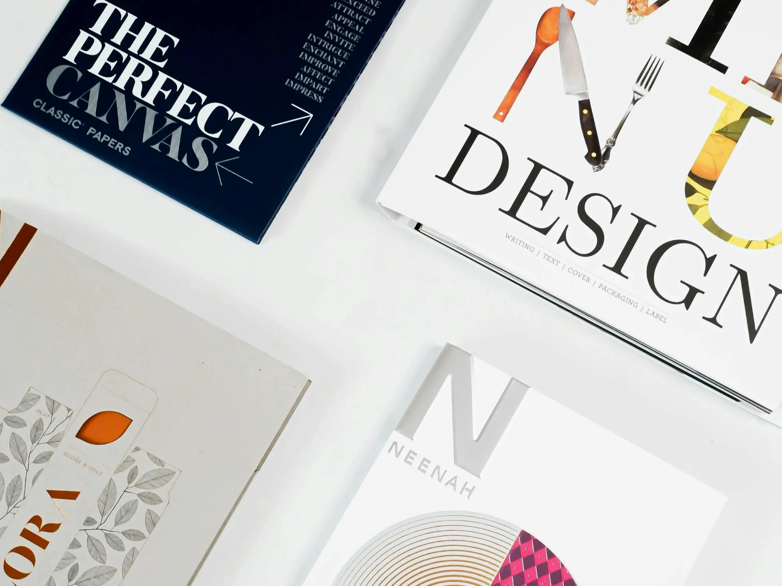
Typography conveys more than just information. It creates atmosphere, attitude, clarity. It's a central component of your visual identity – just as defining as colours or images. On websites especially, typography plays a crucial role. It structures content, creates rhythm and provides orientation. And it shapes that first impression: elegant – bold – reduced – playful?
What works technically doesn't automatically look good
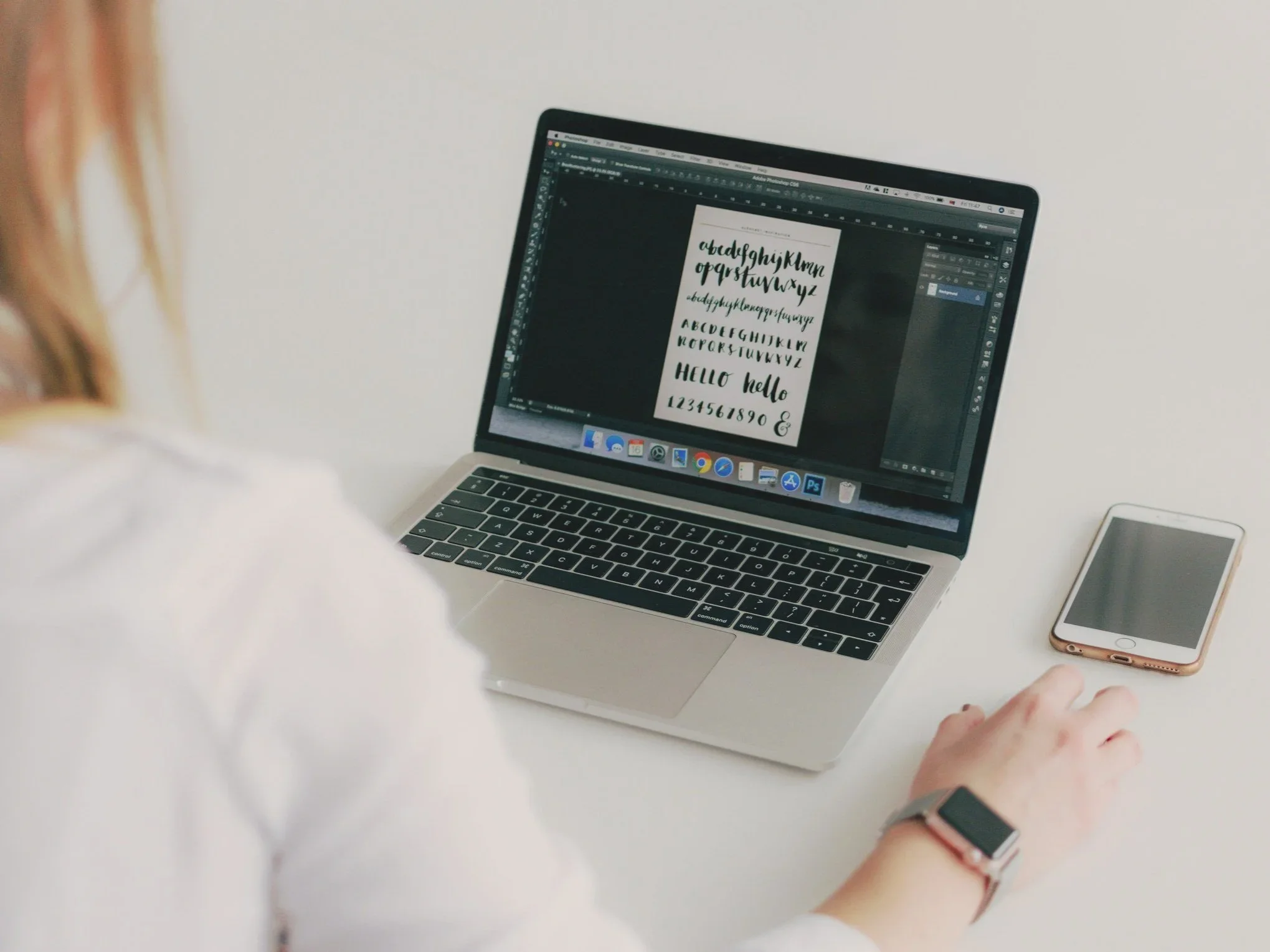
What looks cool on a Canva template can quickly tip into arbitrary territory in web design. And what looks good isn't always easy to combine effectively. Anyone who's ever spent hours browsing fonts knows: you lose yourself quickly in the details. Time you could definitely use better elsewhere.
You want a look with recognition value, clarity and character. But in the font library, hundreds of options await – yet barely any guidance. What goes together? What captures your position precisely? How do you combine style with readability?
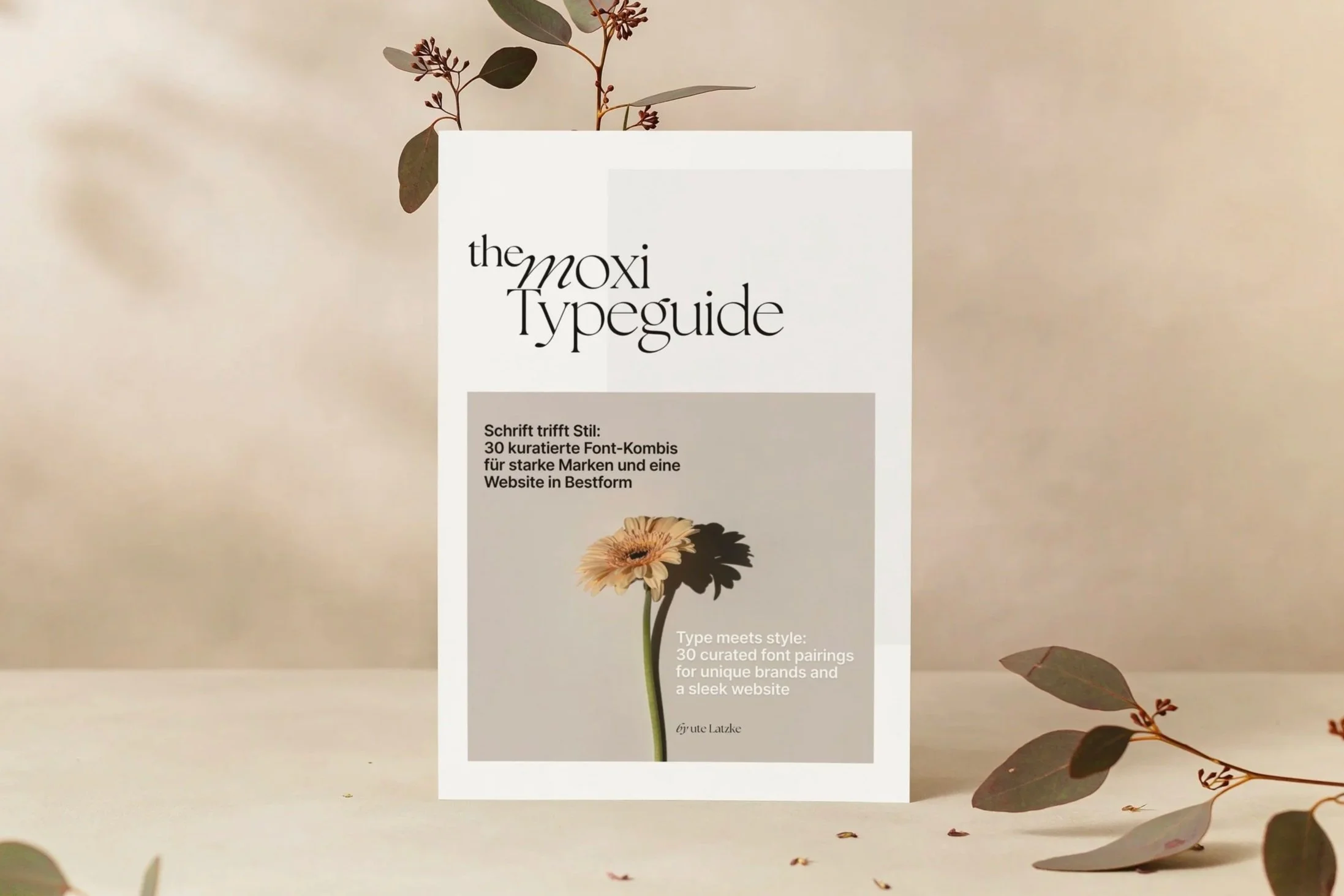
moxi Typeguide: 30 curated combinations
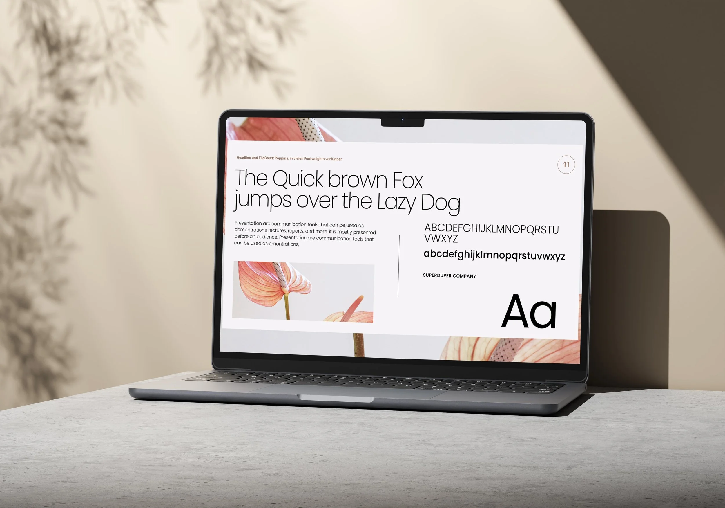
That's exactly why I developed the moxi typeguide. An elegant lookbook with 30 carefully selected fonts. I've specifically selected each font combination for brand impact, readability and aesthetics. All fonts are available in tools like Squarespace and Canva, and often in other web editors too. This makes a consistent brand presence possible across website, social media and print.
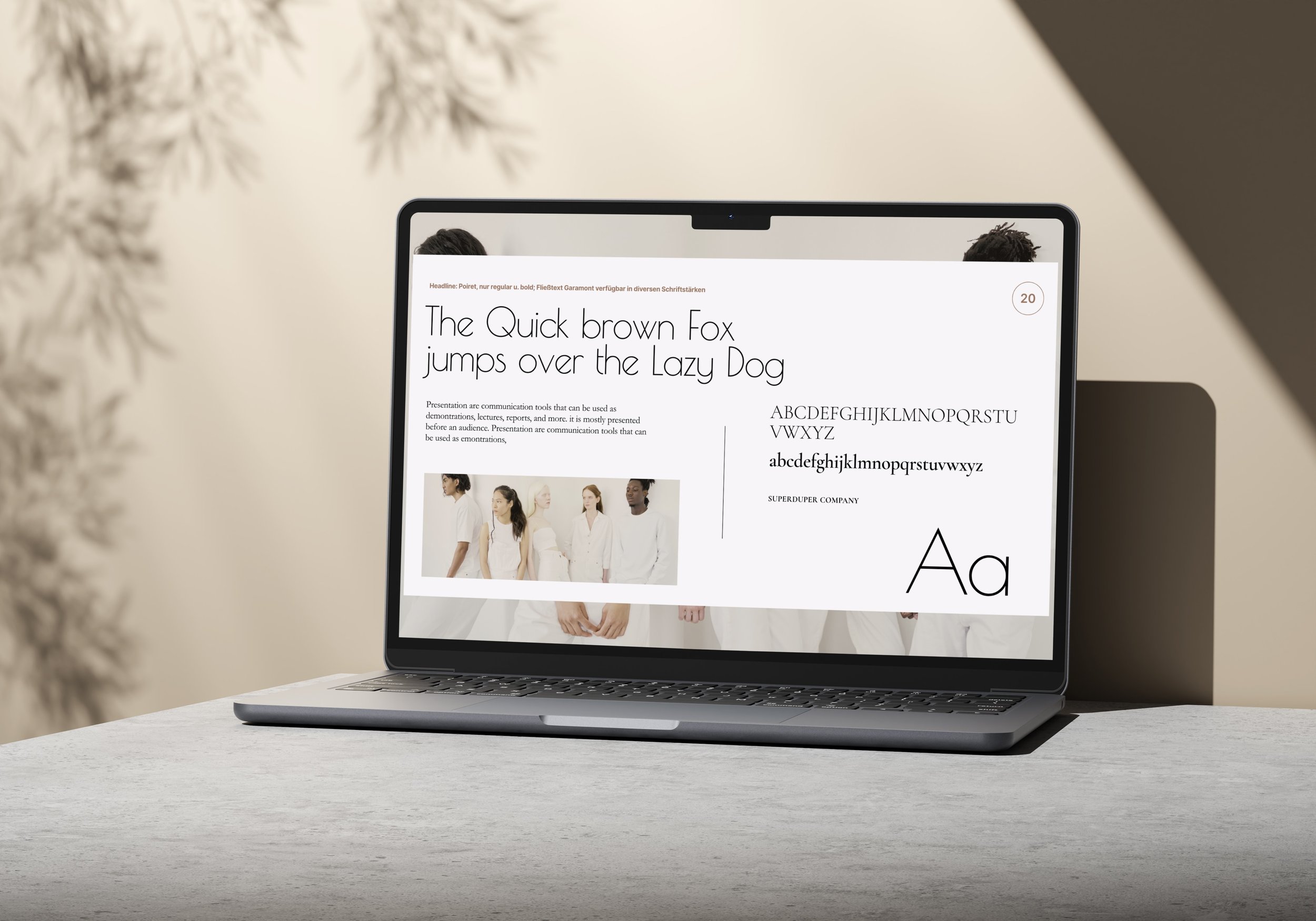
Moods represent the setting
Each of the 30 combinations is complemented by an attractive mood image – so you can see directly how the typography works in different settings. From clean and reduced to elegant, edgy or expressive: the range inspires you and gives you a basis for decision-making.
For creative minds with standards & style
The moxi Typeguide is aimed at architects, designers, photographers and all discerning creatives whose website should have an aesthetic and convincing impact. You'll see a selection of the font pairings here in the article. All 30 are exclusively in the lookbook, plus tips on proper typography usage and a checklist. Have a look here.
Prefer to read the German version? Click here >